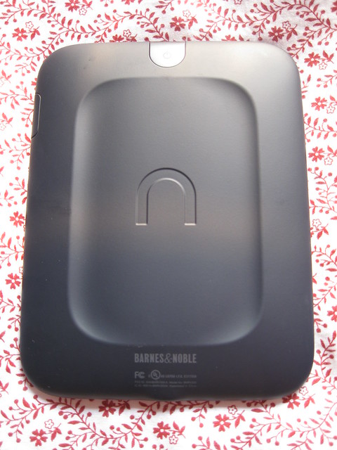
The new Nook is really exciting. The screen is incredibly crisp, even without taking into account that it is a touch screen. Supposedly the battery can last up to 2 months. I fully charged it out of the box, as recommended, before setting it up, so I will see how long it lasts for me before dying.
The touch screen is surprisingly responsive. I find it to be more responsive and quick than the LCD touch screen on the Nook 1st edition. I haven’t used the Nook Color, so I’m not sure how it compares there.

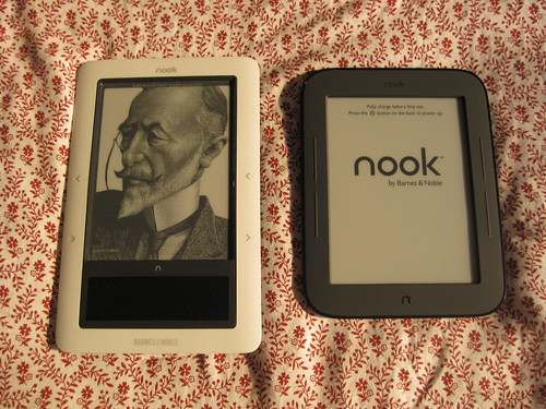
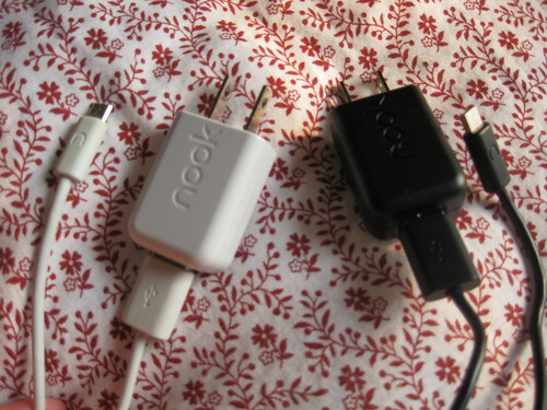
The Nook Touch Reader feels a lot smaller and lighter to me than the Nook 1st Edition. It lacks the LCD touchscreen (which is fine by me since this e-ink screen is surprisingly dynamic), and the bezel is a different texture. On the Nook 1st Edition, the bezel is curved, shiny plastic where on the Nook Touch Reader, the bezel is flat matte rubbery material. The ports and chargers are the same micro USB.


So far, I’m really impressed with the new Nook Touch Reader. It is the closest thing I’ve found to the idea that captured my imagination when I first learned about e-readers and e-ink displays.
The screen is sharp and responsive, in both the visual and tactile sense. The physical buttons (4 side buttons and the “n” button at the bottom) have an improved response in comparison with the Nook 1st Edition. They are not as difficult to push, and the raised “n” button and ridges make the buttons easier to find by touch than the buttons on the Nook 1st Edition. The original Nook has raised dots to denote the buttons, and the “n” menu button is part of the touch screen, giving no tactile feedback.
Some features are currently missing; it doesn’t have any games like the chess and sudoku on the Nook 1st Edition. I’m not sure how many people played games on the old e-ink reader, however. Maybe with the increased popularity of apps on the Nook Color, a few may migrate to the Nook Touch Reader without the assistance of hacking. There are new social features. You can connect to your facebook, twitter, and/or google accounts. Connecting to your google account mostly seems to allow you to invite people to become “nook friends” so you can share books.
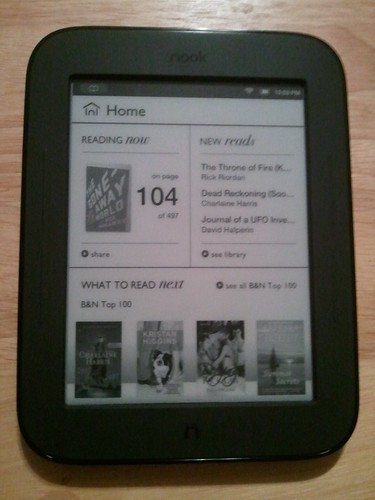
The home screen experience is interesting. The bottom of the screen seems to be devoted to advertising, which is kind of annoying. Edited 06/09/2011: When you have Nook Friends, apparently this shows their top recommendations. When you don’t (like me) it seems to be showing a couple of the Top 100 in the B&N store. What I do like is the top left portion of the screen shows what you’re currently reading, and your progress in pages. The top right portion of the screen shows your most recently acquired books. The top bar houses notification as normal: wi-fi signal, battery life, and time on the right. On the left, is a special notification icon that will list more specific notifications. I had one pop up when I connected to my google account, encouraging me to invite my google contacts to become nook friends.

I’ve only had this for a few hours, so I’ll continue using it over the coming week or two and post more updates of my impressions.
Ryan
When you connect to your google account does it allow you to check your gmail?
astranoir
It connects to your B&N account, not your google account.